A typeface project, blending the chosen themes and applying to a real-world campaign
“Rebels of Renaissance” is a purely typeface driven project during which a theme was chosen to design and develop a unique typeface that fully represents it in terms of visual elements and layout building. This theme was chosen due to my interest of combining traditional methods of artwork along with digital, creating a balanced outcome that compliments each method equally.
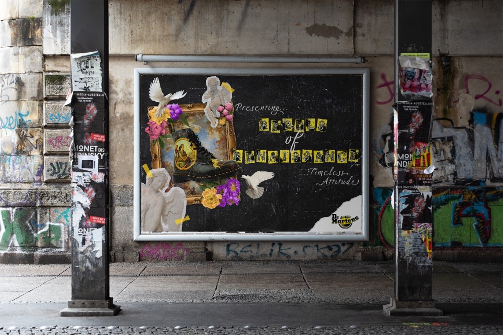
Solution
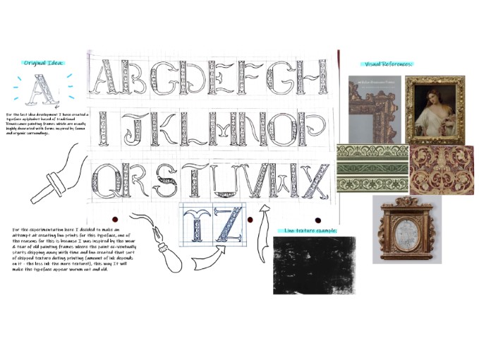
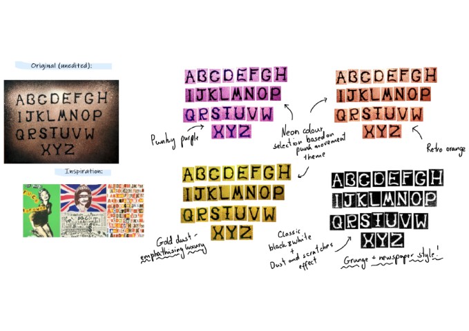
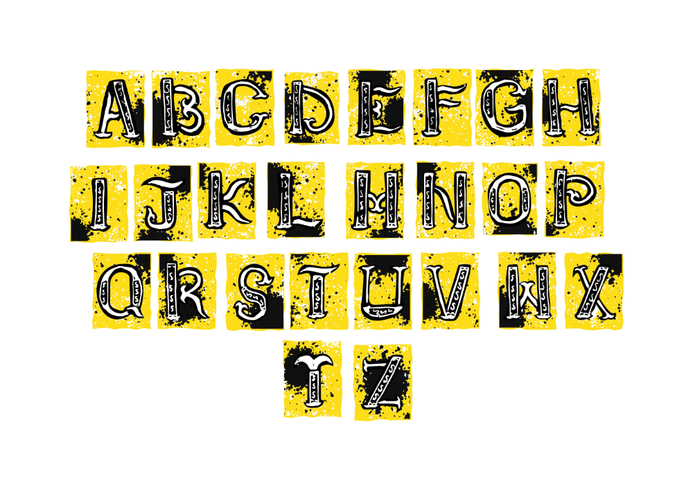
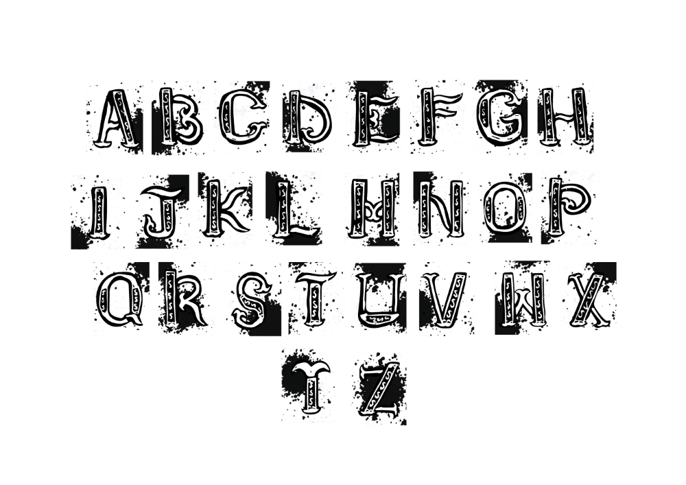
The designed typeface was created by taking inspiration from Jamie Reid’s iconic 70’s punk style typeface cut-outs combined with an elegant, yet somewhat broken-down cursive style of type inspired by Renaissance and Baroque structural elements. The typeface was later brand colourised and applied to a campaign of my choice. A billboard campaign was created, complemented by the typeface representing the Dr. Martens X The National Gallery collection, focusing on shoe designs that represent classic and iconic artworks from the past, creating a fusion of traditional and rebellious nature.